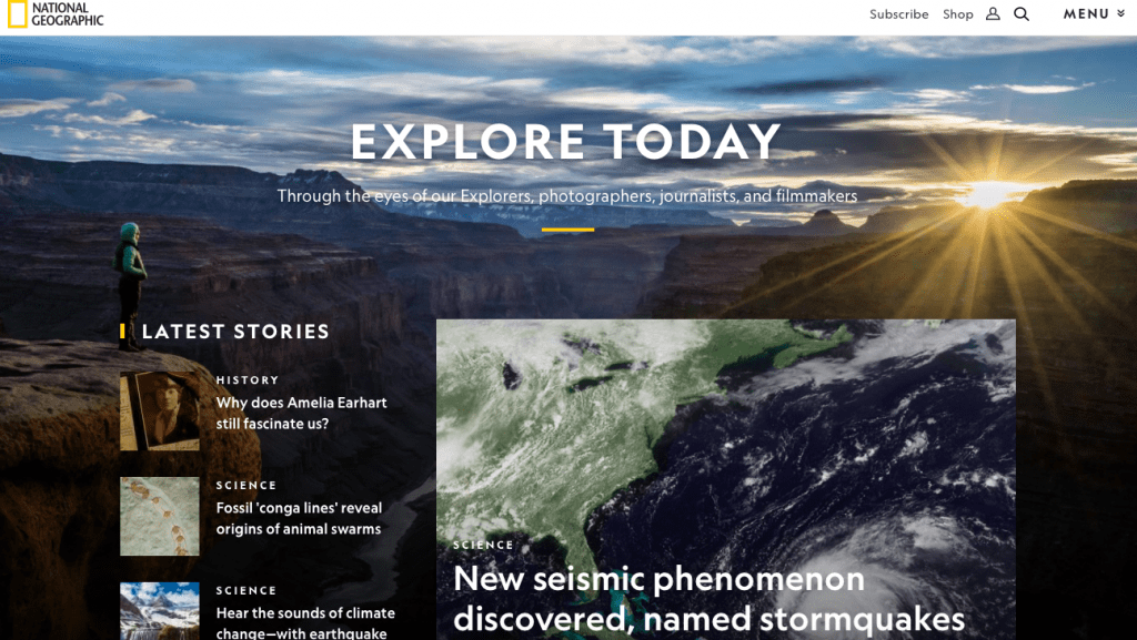
Here’s what National Geographic’s site looks like from your desktop:
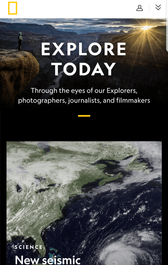
And here it is on an Android smartphone:
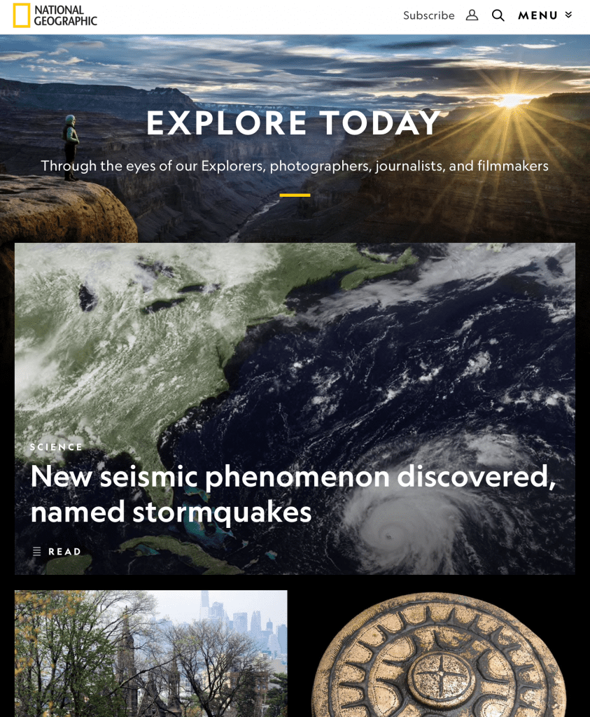
How about an iPad?
Now, what do all three images have in common?
The text is large and readable. There are no page breaks. By the way, it’s a single URL—something Google’s recent mobile-first indexing move is big on.[1] The logo is in the upper left corner. The site’s cleanly organized. You get the point: National Geographic’s website kills it across devices! In the web dev world, we call this application adaptable responsive web design (RWD, for short).
It’s a very important and absolutely necessary concept web developers need to know, especially front-end.
Today we’re discussing RWD 101!
Psst, you don’t want to miss this!
RWD is Super Important
The facts spell it out:
- A growing number of US consumers are turning to their phones for online purchases.[2] So businesses need web devs for rising m-commerce retail trends.
- Most Americans have multiple devices: According to Pew Research, almost 75% of Americans have a mobile phone and desktop or laptop computer.[3] Responsiveness is vital.
- RWD isn’t going away, especially on mobile: predictions show a majority of people will hop on the internet from their smartphones come 2025.[4]
Random fact: Web design’s been around since Pearl Jam.
Responsive Web Design Explained
RWD uses HTML and CSS to make sites look good on all devices—iPhones, Androids, laptops, desktops, you name it.[5]
We need to be able to change devices, not worrying if the content’s changed, where’s the homepage, and are media queries good to go.
CSS Grid, CSS Frameworks, and Media Queries
With more intuitive web builders (expected to become a $13.6 million industry by 2027[6]) and more responsive custom sites, it’s weird to think web design goes back to 90s’ innovations, HTML and tables.[7]
Nowadays, CSS grid (a fancy term for 2D layouts that structure sites using CSS[8]) seems to have replaced tables: What we’ve noticed on Twitter and across the web, CSS grid is generally considered more flexible and adaptable than HTML tables.
As one Quora user mentions, with CSS grid, it’s easy to play around with elements and great in building various grids.
We can’t forget CSS grid is also compatible with all major browsers, as you see below:[9]
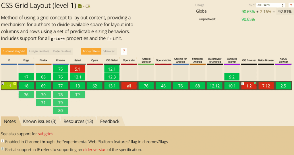
Random Dev Tip: caniuse.com is a public GitHub-supported, Patreon-funded resource for web developers to quickly check browser compatibility.
CSS Frameworks
But it’s only one tool of many. According to one Redditor, a grid [system] is the place to start: do your research, pick a grid, and stick to it.
Bootstrap tops the CSS framework list because of its popularity. There literally are tons of tutorials, extensions, and plug-ins for this framework.[10]
Foundation, another favorite, is a solid go-to for big names such as Mozilla, eBay, and, yes, shout out again to National Geographic. It’s a great professional framework with business support and resources.[11]
However, there are many to choose from, like Semantics, Pure, Material-UI, and UIkit. For that reason, we encourage you to do your CSS homework.
Fun Fact: CSS grid is not a CSS framework. Think of it as a specific tool that can replace parts of the CSS framework but isn’t a direct replacement. In a lot of cases, a CSS framework may be easier to use.[12]
Media Queries
Remember those screenshots of National Geographic’s site on the three devices? You probably noticed the images were the same, easy to view, but different sizes. For this, we have media queries to thank.
A media query includes a media type (i.e., image, video, etc.) and expressions (ranging from zero to, well, a lot) that check for the conditions of certain media features like width, height, and color.[13]
To make sure a site’s images and videos are responsive on multiple devices, web developers need to input specific media queries for different devices.
But don’t forget screen orientation: You know when you turn your phone horizontally how suddenly the image gets wider? Yes, we need media queries for that.
As Steve Krug says in his book, Don’t Make Me Think, when web developers are creating a site, “We’re thinking “great literature” …while the user’s reality is much closer to “billboard going by at 60 miles an hour.”[14]
Media queries (site layout and other responsive elements, too) make it easier for that user flying by at 60 miles per hour to scan sites. Possibly even purchase an item or share some eye-catching social content.
Navigation Is an RWD Have-To
“People won’t use your Web site if they can’t find their way around it.”
Steve Krug, Don’t Make Me Think Revisited
Without tabs, a homepage, and of course, the good ol’ back button—the most used button on browsers[16]—users would be lost down columns of endless internet aisles.
No wonder navigability ranks first (62.86%) as one of the most commonly discussed (in research circles) elements that affect engagement. Graphical representation (60%) and organization (42.86%) take second and third.[17]
A beautifully-sized image is great but doesn’t do much if the user’s unsure where to go from there, or where they are on the site. Part of responsive design is ensuring the user always knows where home is (pun intended),[18]and has accessible navigation tools (i.e., categories, menu, etc.) to explore the site.
Dev Tip: Accessibility testing for navigation (and overall site) is an RWD (and front-end dev) must.
Start Advancing User Experience with GitHub, Free Code Camp, & More
This was a lot of information and terms thrown at you. If you’re head’s reeling, it’s ok. Our hope is you get the gist of what RWD is! Explore free, community-based platforms like GitHub and Free Code Camp to get the hang of how responsive site design works.
Have RWD questions and comments to share? Join the discussion below!
References
[1]Google Developers: Prepare for mobile-first indexing
[2]Statista: U.S. mobile retail commerce sales as percentage of retail e-commerce sales from 2017 to 2021
[3]Pew Research: Mobile Fact Sheet
[4]CNBC: Nearly three quarters of the world will use just their smartphones to access the internet by 2025
[5]Medium (Prototypr): 3 Tips to Get Started with Responsive Design
[6]Zion Market Research Report: Global Industry Perspective, Comprehensive analysis, and Forecast, 2018-2027
[7]The Conversation: A nostalgic journey through the evolution of web design
[8]Redesigning a Site to Use CSS Grid Layout by Craig Buckler, et. al
[9]Redesigning a Site to Use CSS Grid Layout
[10]JGRCS: Review of Different Responsive CSS Front-End Frameworks
[11]JGRCS: Review of Different Responsive…
[12]Smashing Magazine: CSS Frameworks Or CSS Grid: What Should I Use For My Project?
[13]W3C: Media Queries
[14]Don’t Make Me Think Revisited by Steve Krug
[15]Don’t Make Me Think Revisited, Krug
[16]Don’t Make Me Think Revisited, Krug
[17]NCBI: A Literature Review: Website Design and User Engagement
[18]Don’t Make Me Think Revisited, Krug