UI design, or user interface design, plays a pivotal role in the tech industry. A well-crafted user interface can drive engagement, increase user satisfaction, and ultimately, boost the success of a digital product. On the flip side, a poor UI design can lead to user confusion, frustration, and even loss of users. Unfortunately, there are a number of common mistakes that individuals often fall prey to when designing a user interface. But fear not, this post is designed to help you navigate these pitfalls and provide practical solutions to avoid them.

Understanding UI Design
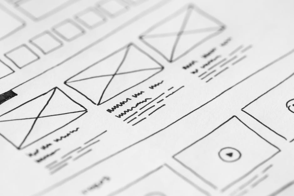
UI design is all about creating interactive and intuitive digital environments. It’s the bridge between users and a digital product, be it a website, an app, or a software. An effective UI design is one that’s not only aesthetically pleasing but also easy to navigate, consistent, and responsive. It’s a fine balance of technical functionality and visual elements, such as color schemes, button styles, typography, and icons.
Why Mistakes Happen in UI Design
So, why do these common mistakes persist in UI design? There could be several reasons. A lack of understanding of users’ needs is a key one. After all, a user interface is designed for users, and if it doesn’t cater to their needs, it’s bound to fail. Another reason is overlooking the fundamental principles of design for the sake of aesthetics or novelty. And let’s not forget the pressure to meet deadlines, which often leads to rushed designs and overlooked details.
Delving into Common Mistakes
Now that we’ve highlighted the importance of UI design and why mistakes often happen, let’s dive deeper into the common mistakes themselves. By discussing each mistake individually, we hope to provide a clearer understanding of what these mistakes are, why they’re problematic, and the potential negative effects they can have on the user experience. Ready? Let’s get started.
Inconsistent Design
Consistency is a cornerstone of effective UI design. However, it’s often overlooked, leading to a disjointed user experience. Inconsistent design can be as simple as varying font sizes and colors, or as complex as different navigation styles across a single app or website. But why is this a mistake? Because inconsistency can confuse users and make your product harder to navigate. This, in turn, can lead to frustration and eventually drive users away from your product.
Think about it. Have you ever used an app or website where you had to relearn how to navigate every time you accessed a different section? Quite frustrating, wasn’t it?
Ignoring Accessibility
Another common mistake in UI design is ignoring accessibility. Accessibility in this context means designing your product in a way that all users, including those with disabilities, can use it effectively. Ignoring accessibility can exclude a significant portion of your potential user base, which is not only a poor business decision but also ethically questionable.
Imagine being unable to use a product simply because the designer didn’t consider your needs. Doesn’t sound very fair, does it?
Overloading with Information
Information overload is a real problem in UI design. It happens when too much information, options, or functionalities are presented at once, overwhelming the user. This can make your product difficult to understand and use, leading to a poor user experience.
Remember, less is often more when it comes to UI design. Users appreciate simplicity and clarity, not confusion and complexity.
Real World Examples of Mistakes
Now that we’ve discussed the common UI design mistakes, let’s look at some non-specific examples of these mistakes in real-world applications. Understanding how these mistakes play out in actual products can help us better grasp their implications.
Consider a social media app that uses different navigation styles for each of its sections. This inconsistent design can confuse users, making the app difficult to navigate and potentially driving users away.
Or think about a news website that presents all its content on the homepage without any clear hierarchy or categorization. This information overload can overwhelm users, making it hard for them to find the information they’re looking for.
Finally, consider a popular e-commerce website that doesn’t provide any accessibility features, such as text-to-speech functionality for visually impaired users. This lack of accessibility can exclude potential users, limiting the website’s reach and potential success.
How to Avoid These Mistakes
Have you ever wondered how you can avoid falling into the trap of common UI design mistakes? The answer is not as complicated as you might think. The first step is to adopt a user-centric design approach, followed by consistent testing and refinement of your design. Remember, the primary aim of UI design is to create a seamless and enjoyable user experience. Therefore, always keep your users at the heart of your design process.
Adopting User-Centric Design
What is user-centric design? Simply put, it’s a design approach that prioritizes the needs and preferences of the user. This involves understanding your target audience’s behavior, preferences, and needs. By doing so, you can create a design that is intuitive, user-friendly, and satisfying to use.
But how can you implement a user-centric design approach? Start by conducting user research. This could be through surveys, interviews, or user testing. Gather as much data as you can about your users. What are their needs? What do they like or dislike? What are their expectations? The answers to these questions will provide invaluable insights that will guide your design process.
Emphasizing on Testing and Refinement
Testing and refinement are crucial aspects of the design process. They allow you to evaluate the effectiveness of your design and make necessary adjustments. Remember, no design is perfect from the get-go. It’s through testing and refining that you can improve and perfect your design.
There are various methods of testing you can use, such as usability testing, A/B testing, and user feedback. These methods provide direct feedback on how your design performs and how it can be improved. Always be open to feedback and be willing to make changes. It’s through this iterative process of testing and refining that you can create a design that truly meets the needs of your users.
Utilizing UI Design Tools
Are you leveraging the power of UI design tools? If not, you’re missing out. UI design tools can significantly enhance the efficiency and quality of your design process. They offer a wide range of functionalities that can help you avoid common design mistakes.
For example, design tools like Sketch and Adobe XD allow you to create wireframes, prototypes, and interactive designs. They also offer features for collaboration, allowing you to work seamlessly with other team members. Tools like Zeplin and Avocode, on the other hand, facilitate handoff by generating style guides and resources for developers.
Remember, the key to avoiding common UI design mistakes lies in understanding your users, testing and refining your design, and utilizing the right tools. By following these steps, you can create a design that is not only visually appealing but also functional and user-friendly.
Learning from Others’ Mistakes
Have you ever heard the saying, “A smart person learns from their mistakes, but a wise person learns from others’ mistakes?” This wisdom holds true in the realm of UI design as well. Learning from others’ mistakes in UI design is not just an option—it’s a necessity. But why is it so important?
First, it can save you a lot of time and resources. By understanding where others have gone wrong, you can sidestep these pitfalls and avoid the same errors. Second, it can accelerate your learning curve. Each mistake is a lesson waiting to be learned. By studying these lessons, you can gain insights that would otherwise take you years to acquire.
However, it’s important to note that learning from others’ mistakes doesn’t mean copying their solutions. Each design has its own unique context and constraints, so what worked for one might not work for another. The key is to learn the underlying principles and adapt them to your own design.
Final Words on Mastering UI Design
In conclusion, mastering UI design is not a destination, but a journey. It’s a journey of continuous learning, experimentation, and refinement. It’s about staying updated on the latest design trends, principles, and tools. It’s about learning from both your own mistakes and the mistakes of others. Sounds challenging, doesn’t it? But remember, every expert was once a beginner.
As a UI designer, your ultimate goal should be to make the user’s interaction as simple and efficient as possible. This requires a deep understanding of user needs, a keen eye for detail, and the ability to think critically and creatively. It also requires the courage to admit and learn from your mistakes.
So, are you ready to take up this challenge? Are you ready to actively avoid the common mistakes we discussed and to continually refine and improve your design skills? If your answer is yes, then you are on the right path to mastering UI design. Good luck on your journey!